LANDING PAGE… Say What?
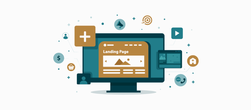
Think of a landing page like the front door to a very specific room in your house. It’s not the whole house (your website). It’s one room with one job.
A landing page is a place online where someone “lands” after clicking a link—like from an email, a social post, or an ad. But instead of giving them everything all at once, this page has one clear message and one clear next step.
Here’s what a landing page is meant to do:
- Explain why it matters
- Tell someone what you’re offering
- Show them what to do next (like click a button, sign up, or buy)
It’s not filled with menus, links, or distractions. It’s focused. Simple. Clear.
How Is It Different From a Website?
Most websites are like big department stores. Lots of choices, lots of places to go. You can browse, explore, and take your time.
A landing page is more like a pop-up shop with one focus:
“This is what we’re about. Here’s what to do next.”
It works best when you want to guide someone quickly through a decision:
👉 Sign up
👉 Buy now
👉 Learn More
👉 Download Here
Why Should You Use One?
Because people are busy. Attention spans are short. And most of us don’t like guessing what to do.
A good landing page:
- Makes it easy to understand your offer
- Builds trust quickly
- Helps someone decide fast without feeling rushed
Want to See One in Action?
Here’s a real example I made:
Suffering Silently Ends Here
This page tells the story of my journey through grief and offers a free audiobook—no fluff, no pressure, just an invitation to listen and heal.
That’s what a good landing page does.
It talks straight.
It makes it simple.
It shows up for the person on the other side.